
Which Content Block layout should I use?
New to blocks?
New to blocks? Start with “How do I add or edit a content block?”.
The layout decides how a block’s items are shown. The same text can look very different in each one, so choose by what you want the visitor to do with it.
Text
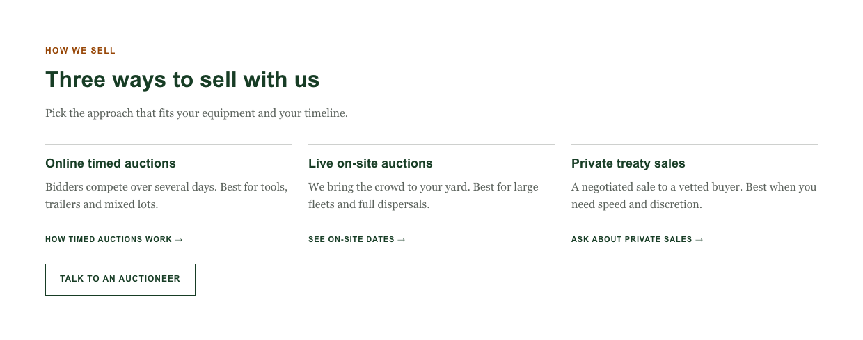
What it is: items shown as plain columns with a thin line on top. No box, no number.
Shines when: you have two to four short descriptions that belong side by side, for example how you sell or what you offer.
Skip it when: you want each item to stand out like a button or a card.
Fill in: Title and Text for each item. A link is optional.
Cards
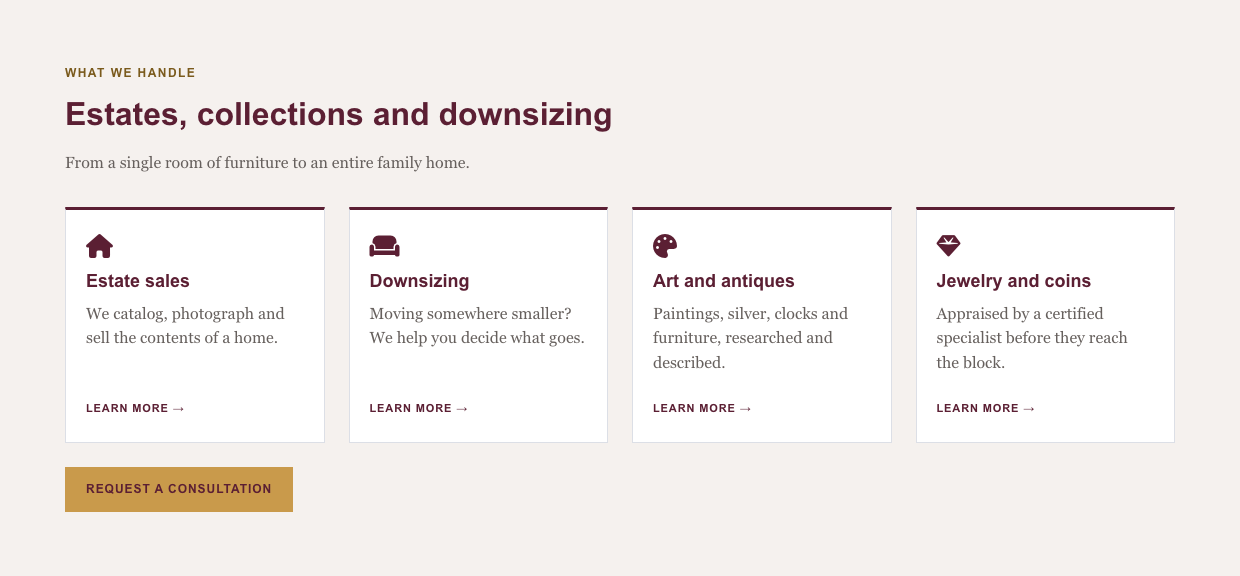
What it is: each item is a box with an optional icon, a title, a line of text and a link.
Shines when: each item leads somewhere, such as services or categories.
Skip it when: the text is long. Keep it to one short sentence per card.
Fill in: Icon (optional), Title, Text, and Link Label plus Link URL.
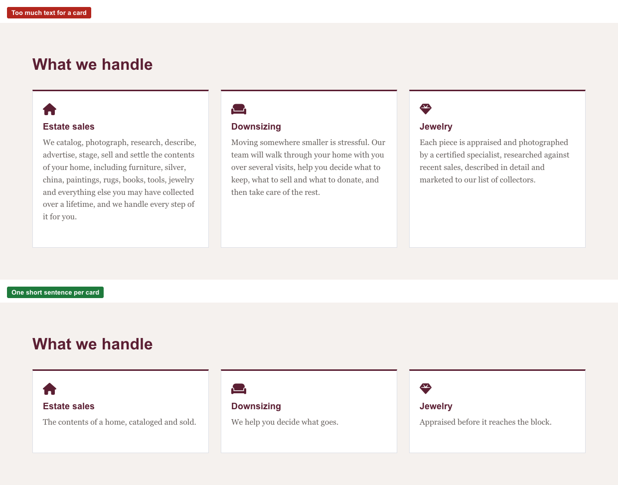
Cards work best with one short sentence each.
Steps
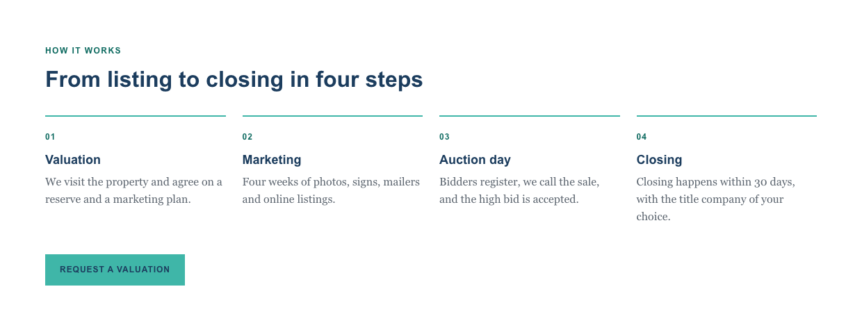
What it is: a numbered list, one step per item.
Shines when: there is an order, such as how an auction works from first call to payment.
Skip it when: the items have no order. Use Text or Cards instead.
Fill in: Title and Text for each step. The numbers are added for you.
Stats


The same block with an icon beside each number.
What it is: big numbers with a short label under each.
Shines when: you have two to four facts that build trust: years in business, lots sold, buyers registered.
Skip it when: you want to say something in sentences.
Fill in: the item’s Title / Value is the number, the Text is the label under it. Write the label so it reads after the number (“lots sold every year”).
Tip: an icon shows beside the number.
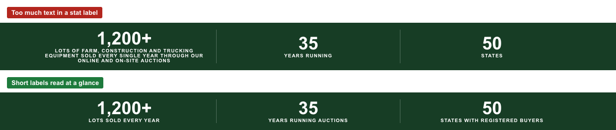
Keep labels short.
Badges
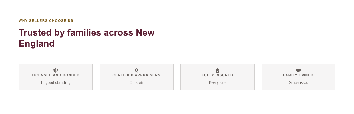
What it is: a row of short names, each with an optional icon and a line of small text.
Shines when: you want to show credentials, memberships or guarantees.
Skip it when: a badge needs an explanation. Use Cards.
Fill in: the item’s Title is the name. Text is optional and small.
Call to action

What it is: a heading, a short description, a short plain list and up to two buttons.
Shines when: you want the visitor to act now, usually near the end of a page.
Skip it when: it would be the first block on the page with no context, or you want three or four different actions. Give one main action.
Fill in: Block Title, Description, up to three short items, and the buttons.
Auction Feed
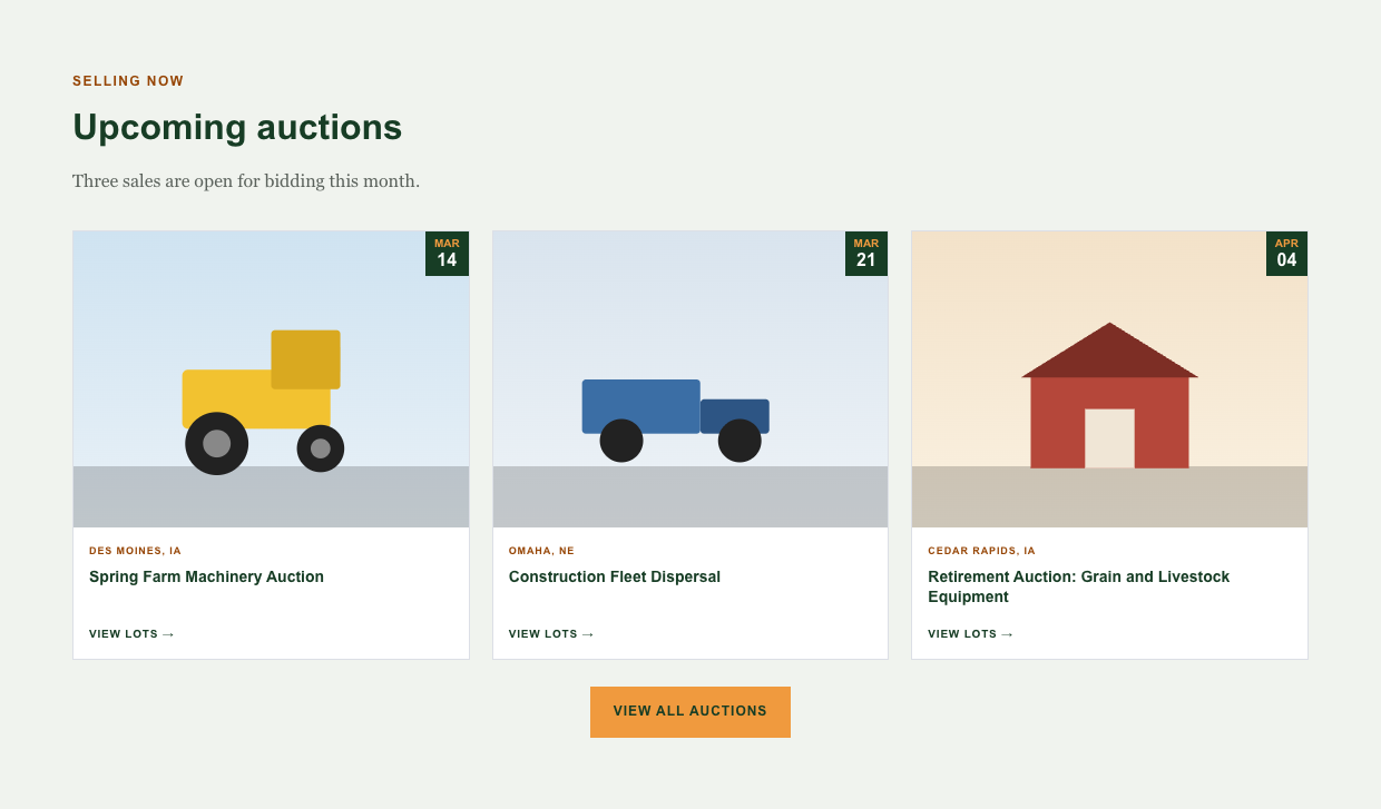
What it is: a live list of your upcoming auctions, taken from the bidding platform.
Shines when: on your home page or a landing page, to show what is selling now.
Skip it when: you rarely have auctions. Visitors then see a “Check back soon” message.
Set up: see “How do I set up the Auction Feed block?”.
Backgrounds
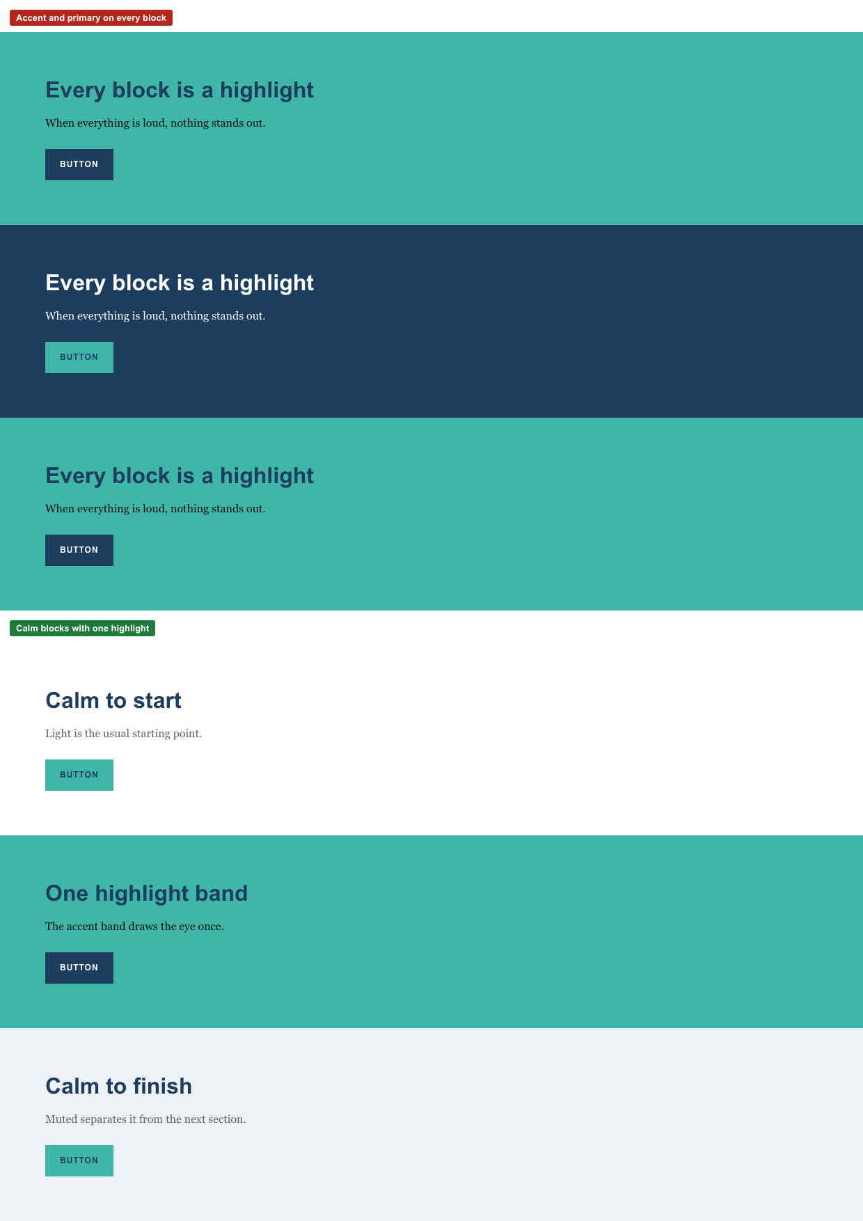
You choose only the background. Text, headings, links and buttons adjust on their own. The colors come from your site’s brand, so the same choice looks different on each site, but it plays the same role.
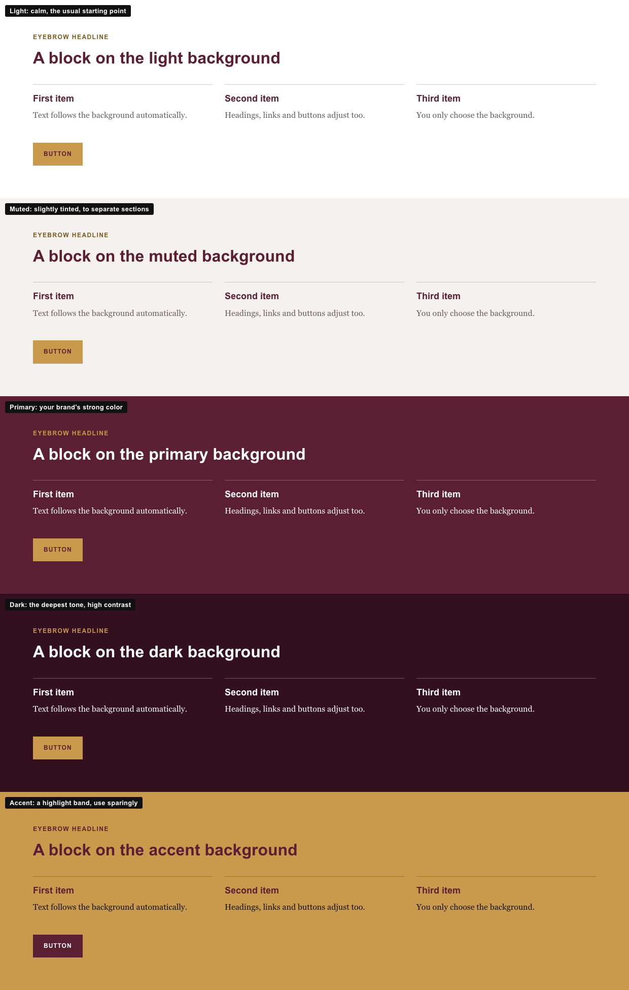
Light: calm, the usual starting point.
Muted: slightly tinted, to separate sections.
Primary: your brand’s strong color.
Dark: the deepest tone, high contrast.
Accent: a highlight band, use sparingly.
Using color well
Alternate calm blocks, and use the accent once. When every block is a highlight, none of them stands out.
Alignment
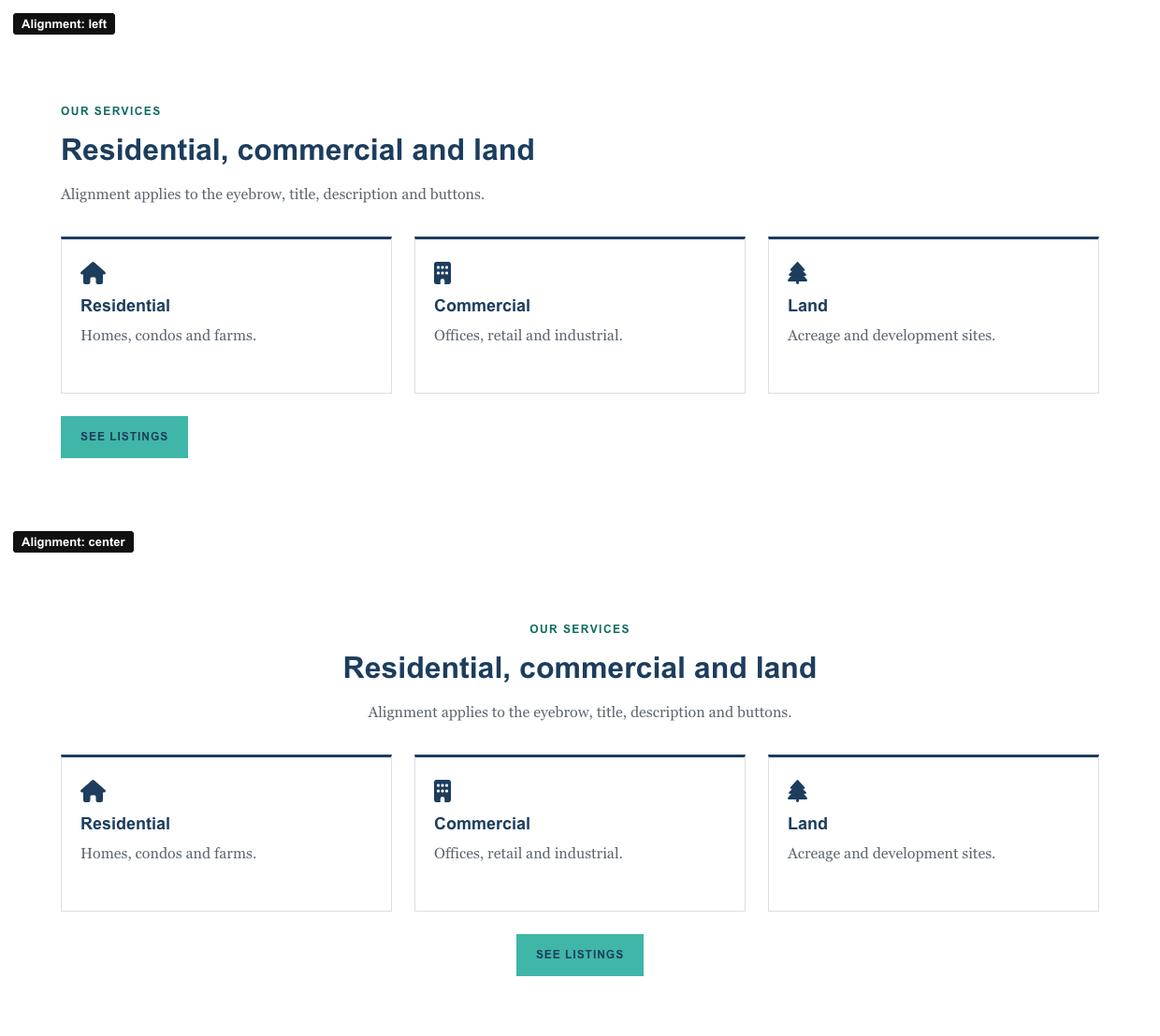
Left or Center applies to the eyebrow, title, description and buttons. Cards and Steps keep their text left-aligned either way.
Putting blocks together
A home page often works as: a calm block that says what you do, a Stats band to build trust, a Cards block for your services, the Auction Feed, and a Call to action at the end.
Keep reading
How do I add or edit a content block? The step-by-step for creating a block and adding it to a page.
How do I set up the Auction Feed block? Show your upcoming auctions on a page.